


| On this page I am going to present some photos that can be enlarged, these are not scaled. Spines do not scan well on a flat bed scanner, so I must resort to high resolution photographs. You can never have enough information when it comes to researching imprints. It may be that even the even the individual text letters will reveal certain excentricities, that can be traced. I have not found this exact fleuron that is the centrepiece of the spine compartments, in Barber's tool catalogue, however I found one that is certainly related Barber's FL 33. |
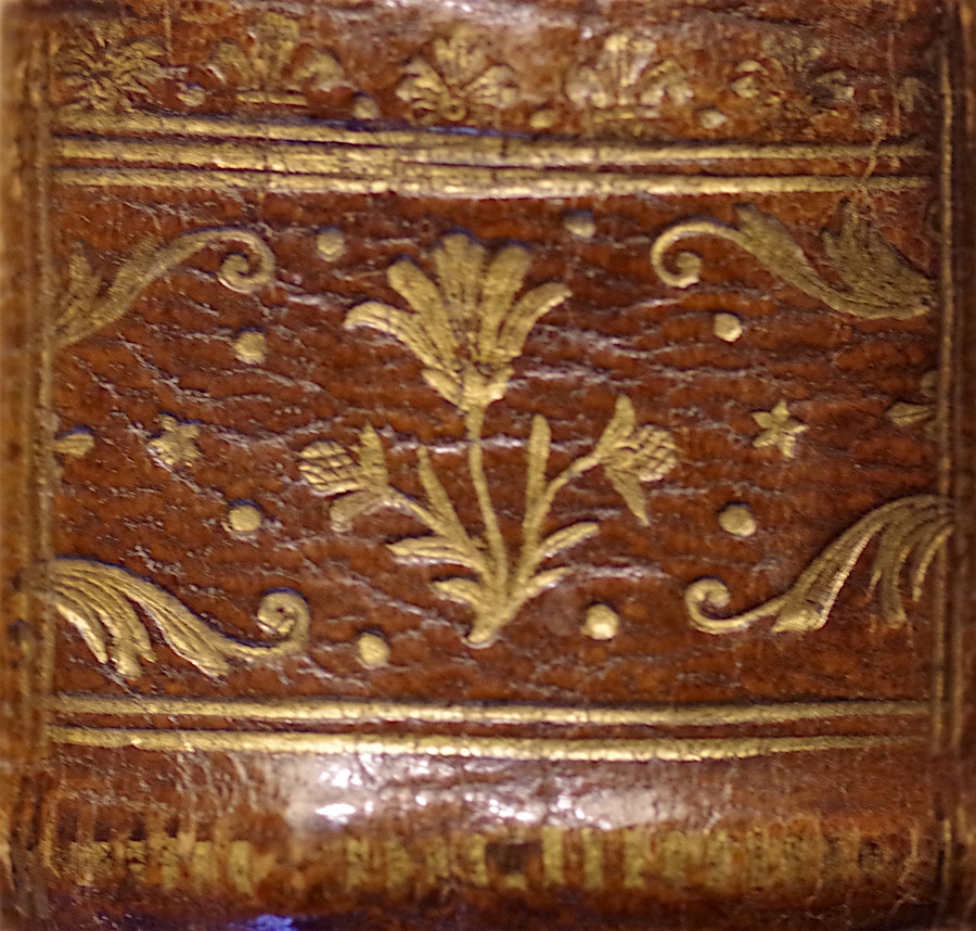
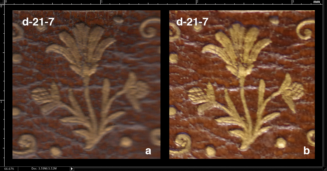
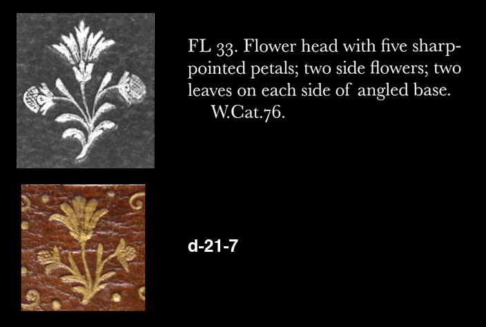
| After writing the above, I realized that I would have to rescale a photo to be able to compare d-21-7 with Barber's FL 33 which is similar but not the same. I scanned the spine and then resized my photo accortding to the scan, the result can be seen in Comparative Diagram 1. I discovered that the photo was nearly twice the size of the 1200 dpi scan, this then was the easy way to do it, I doubled my scan to 2400 dpi and then measured the difference with the photo set to 2400 dpi then it was 111.66 % too small... the importance of this is that the enlarged photos that you can see here if you click on the images, are over 2100 dpi, this is over kill but you never know what you might discover. The end result of the exercise is Comparative Diagram 2, here I show his FL 33 compared with d-21-7 at its correct scale, both are shown at 300 dpi. These two fleurons are too similar for it to be just a coincidence. |
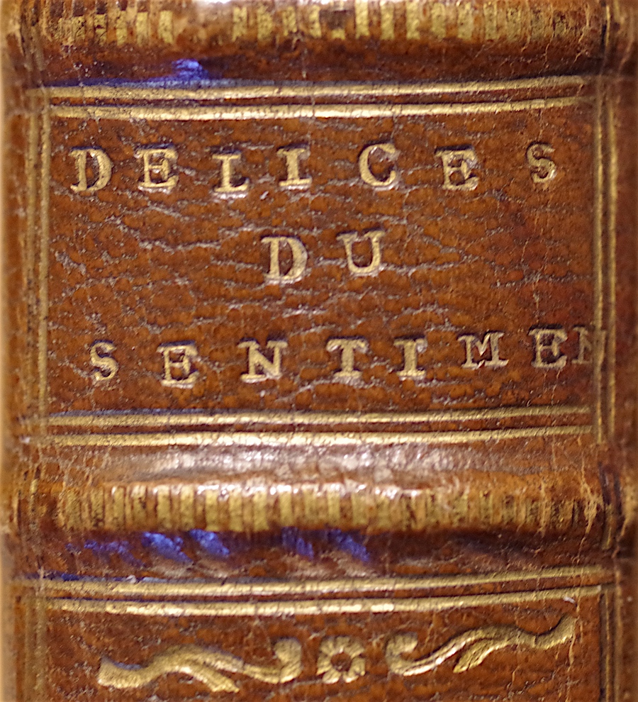
| Looking at the title label we are shocked to see a mixture of type being used here, the 's' and the 'm' being of a smaller size, the 's' is also upside down, whats going on here? It may be that Douceur did not have an 'm' of the right or an 's' of the right size, if so we can expect to see this problem in his other bindings. I strikes me that SENTIMENT... |
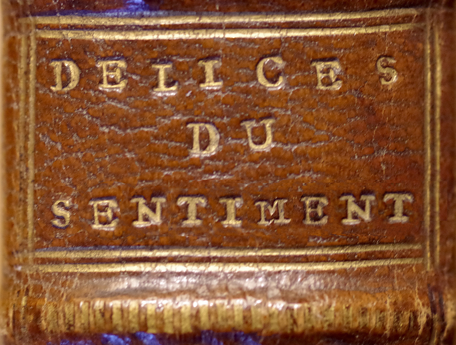
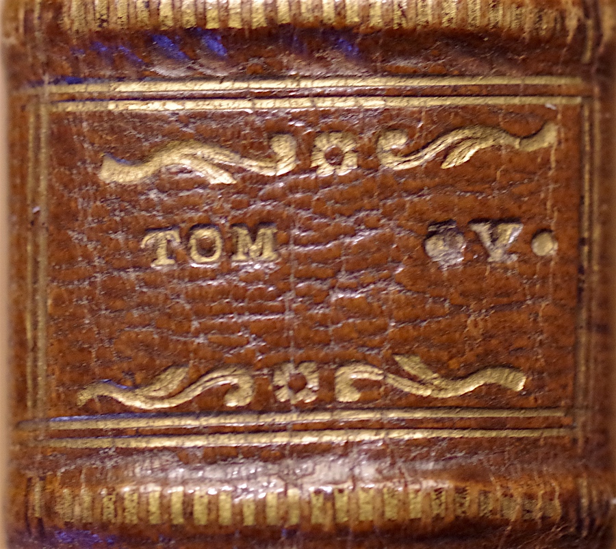
| ...could have fit into the given space quite nicely. I have read somewhere that binders would often turn over the job of titles to someone else, for a number of reasons, and to avoid possible errors... we can see for example, in the tomb label (shown below) that an error was made and then an attempt of a cover up... it appears as though the tomb was first shown as volume 4 'IV' instead of volume 5 'V' and dots added to try to cover this mistake. On the next page we are going to look at another similar but earlier Douceur dentelle binding, where you willl find that the titles are much neater. |
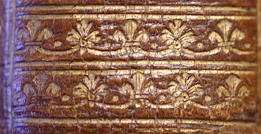
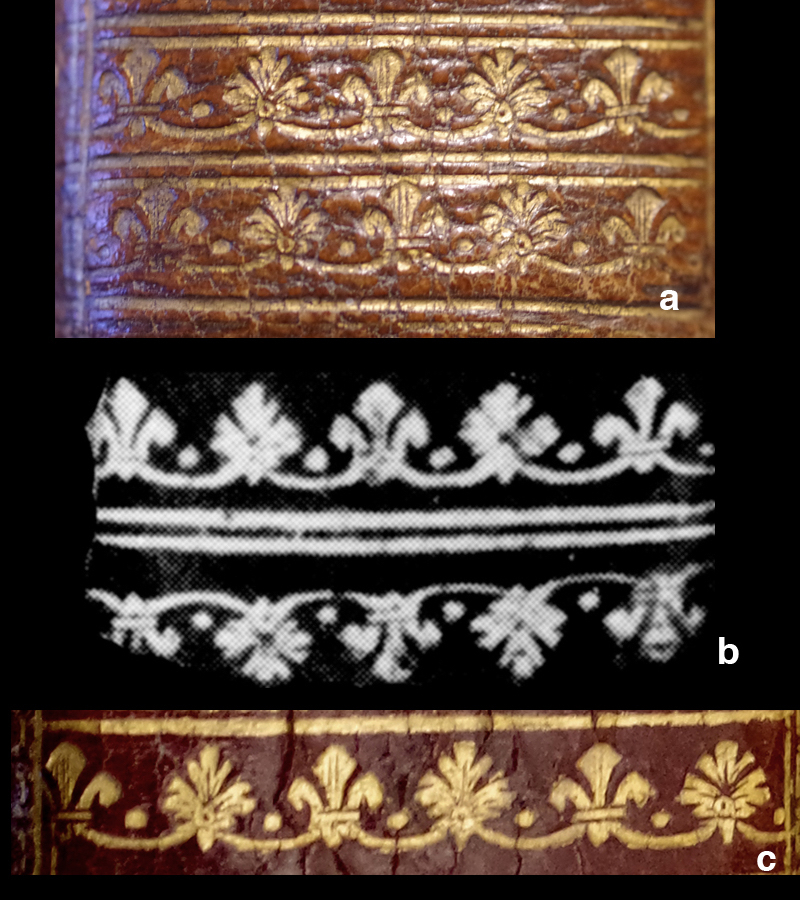
| In Comparative Diagram 3, I show a palette that Douceur used quite often, example 'c' is the first that i have been able to show that is really clear and well defined. On the next page we will examine a 1750 douceur dentelle binding that has a lot in common with our 1754 binding. |
|
click here to return to the HOME page. click here to see the INDEX of the 2017 pages. see below links to previous work |
| Even experts are sometimes wrong, before you spend thousands on a book, please do your own research! Just because I say a certain binding can be attributed to le Maitre isn't any kind of guarantee, don't take my word for it, go a step further and get your own proof. In these pages I have provided you with a way of doing just that. |
| Virtual Bookings, created by L. A. Miller | return to the Home page of VIRTUAL BOOKBINDINGS |